 Mantys Core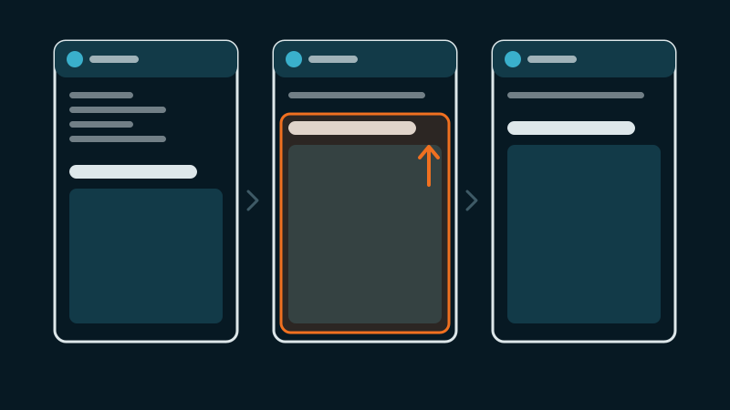
Search Console reports “CLS issue: more than 0.1 (mobile)” on a group of pages. PageSpeed shows a CLS close to zero on the same URL. You scroll the page yourself and see nothing obvious.
The gap is normal: the lab only measures the load, while real visitors scroll, tap and wait for banners. Our guide on lab and field data explains why. Here, the goal is to catch the shift and remove its cause.
Catch the shift in the act
- DevTools, Rendering tab, check Layout Shift Regions: every shift flashes blue as it happens. Use mobile emulation and a throttled network, then scroll the whole page.
- Performance panel: record a load and a scroll. The “Layout shifts” track lists each shift and the elements that moved.
new PerformanceObserver(l => l.getEntries().forEach(e => {
  if (e.hadRecentInput) return;
  console.log(e.value.toFixed(3), e.sources?.map(s => s.node));
})).observe({ type: 'layout-shift', buffered: true });
Note the element and the moment: at load, when a font appears, when a banner opens, while scrolling. The moment points to the cause.
The six usual causes on a builder site
1. Images without dimensions. An image module that prints an <img> without width and height takes zero height until the file arrives, then pushes everything below. Fix: width and height on every image, which lets the browser compute the ratio; or an aspect-ratio on the container.
2. Styles that arrive after the first paint. Builders split their CSS: a global file, then per-page or per-layout files. If one of them loads late, or is deferred by an optimization, an element renders once without its styles, then snaps into place. A real case: on a Divi 5 site, a breadcrumb had no styles of its own and got its font size from a per-layout stylesheet that arrived after the first paint. It wrapped over four lines, then collapsed to one. Field CLS 0.215, invisible in the lab. Giving the breadcrumb its own font size and line height in the inline critical styles brought it under 0.02. Fix: the size-defining rules of anything above the fold must be in the critical CSS.
3. Web fonts swapping. With font-display: swap, text first shows in a fallback font, then in the web font. If the two have different widths, lines rewrap and blocks change height. Fix: preload the one or two font files used above the fold; choose a fallback with close metrics; or tune the fallback with size-adjust and ascent-override in its @font-face.
4. Headers and banners added by scripts. A fixed header whose script adds padding to the page once it has measured it; a top bar or a cookie banner inserted above the content instead of floating over it. Fix: give the page its header offset in CSS from the start, and make banners overlays (position: fixed) rather than blocks that push content.
5. Sliders and carousels before they start. Before its script runs, a slider shows all its slides stacked, or none, then collapses to one slide. Fix: CSS for the state before the script, with the final height reserved and every slide but the first hidden.
6. Embeds and iframes. A video, a map or a social post that loads without a reserved size. Fix: a container with a fixed aspect-ratio, or a lightweight preview that already has the final size.
Builder-specific traps
- Entrance animations: animations based on
transformandopacitydo not count as layout shift; animations that changeheight,marginortopdo. Prefer the former, and avoid animating anything above the fold. - Different mobile header: a mobile header that is taller or shorter than the space the page reserved shifts everything on phones only.
- Stale builder CSS: after a big change, regenerate the builder’s static CSS. A truncated or outdated file can leave rules missing until it is rebuilt.
- CSS optimizations: if the trimmed or deferred CSS lacks the rule that sizes an element, the shift comes back. See our guide on missing styles.
Validate
- Replay the scenario: mobile, throttled, load, scroll to the bottom, open the menu. No blue flashes above the fold.
- Then “Validate fix” in Search Console, and give it the 28 days of the field window.
With Mantys Core
Mantys Core can run your whole performance layer, cache included, or sit next to the setup you already have. On layout shift it covers the space-reservation part that can be automated:
It can add the missing width and height to images, read from the file itself, and an aspect ratio when none is set.
The critical CSS of each page is built from mobile and desktop renders, so what is visible at load is styled at the first paint.
Video facades reserve their box before the player loads.
Font display behavior can be set site-wide, with exceptions per font family.
Banners, slider start states and font metrics remain design choices: the platform takes care of the systematic part so you can focus on those.
In summary
- The lab rarely sees the shift: catch it in DevTools while scrolling and interacting.
- Six causes: images without dimensions, late styles, font swaps, headers and banners added by scripts, sliders before they start, embeds.
- Each fix reserves the space before the content arrives.
- On builders, watch animations, mobile headers and stale builder CSS.
- Validate in Search Console and wait 28 days.
Comments
Stuck on a similar problem? Describe your setup and what you see. We read every comment and answer.
No comments yet. Be the first to share your case.