 Mantys Core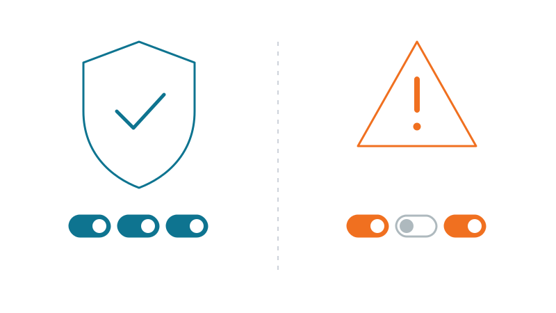
Most people do not dare touch their site’s performance, for fear of breaking everything. It is a legitimate fear: some optimizations can indeed unfold a menu, break the layout, or worse.
But they are not all in the same basket. A large part of the gains is strictly risk-free. The whole point is to recognize those optimizations, turn them on first, and only tackle the trickier levers afterwards, methodically. Where these levers fit in the whole route, from measuring to fixing, is in our guide to speeding up a WordPress site.
The safety criterion: weight, or behavior?
Here is the simple rule that sorts everything:
Safe
Reduces the weight of a file or gives the browser a hint. The render does not change: nothing can break.
Risky
Changes what runs, in what order, or what is served. A feature can break.
Compressing an image sends the same pixels in fewer bytes: the on-screen result is identical, nothing can break. Deferring JavaScript, on the other hand, changes when your menu initializes: there, a component may stop responding.
Keep this criterion in mind for the rest of the article. Anything that only touches weight or hints goes in the “eyes closed” column. Anything that touches execution or render goes in the “to test” column.
The safe wins: turn them on with your eyes closed
Each of these levers reduces weight or sets a hint. None changes your site’s logic.
a. Compress and serve images in the right format
Images are almost always the biggest weight on a page. Compressing them (quality 75-85, invisible to the eye) and serving them as WebP or AVIF (formats lighter than JPEG/PNG, now supported by all recent browsers) often cuts 50 to 70% of the weight. You send the same image, lighter: nothing can break. Also serve them at the right size (via srcset/sizes) rather than at full resolution shrunk by CSS.
b. Lazy-load off-screen images
loading="lazy" on images below the fold tells the browser to download them only as the scroll approaches. It is native, standard, with no side effects. The only trap: never put lazy on the main top-of-page image (the LCP), or you delay it instead of speeding it up. That is not a crash, just a mistake to avoid.
c. Reserve space for images
Adding width and height (or an aspect-ratio in CSS) on your images does not change their weight, but reserves their spot while loading. It removes CLS (Cumulative Layout Shift, content that jumps), one of the most frequent complaints. Risk-free, and often an immediately visible gain. On page builders, the other causes of layout shift are in our CLS guide for Divi and Elementor.
d. Minify CSS, JS and HTML (but not “combine”)
Minifying removes spaces, line breaks and comments: the code does exactly the same thing, in fewer characters. Safe. Be careful not to confuse it with “combining / concatenating” several files into one: that is another lever, trickier (it touches order and dependencies), and it belongs in the to-test zone. Minify ≠ combine.
e. Enable server compression (GZIP or Brotli)
The server can compress text (HTML, CSS, JS) before sending it, and the browser decompresses it on arrival. Brotli or GZIP easily divide text weight by 3 or 4. It is pure transport: the received file is identical. No risk, massive gain, and yet often forgotten.
f. Let the browser cache static files
Long cache headers (Cache-Control, Expires) on your static files (images, fonts, versioned CSS/JS) avoid re-downloading them on every visit. Safe, provided those files carry a version number in their name (which WordPress does with ?ver=) so that an update busts the cache cleanly.
g. Avoid invisible text with font-display: swap
By default, a browser may hide text until the custom font is loaded. font-display: swap shows the text immediately with a fallback font, then switches. Content is readable sooner, and nothing breaks.
h. Give loading hints
preconnect to a domain you actually use (your CDN, Google Fonts), preload on the LCP image or the critical font: these are hints, not execution orders. The worst that can happen if you overdo it is a bit of wasted bandwidth, never a crash. If the LCP image differs between phone and desktop, preload one per device.
The to-test zone: what CAN break (and why)
For contrast, here are the levers that touch execution or render. They are often very profitable, but they require a test after turning them on, because they can alter a feature:
Levers to test after turning on
Critical CSS / “Remove unused CSS”: by keeping only the top-of-page style, they can remove that of a menu or overlay hidden at first, which then show up broken. How to find the missing rule: our guide on missing styles.
Defer / async / delay JavaScript: changing when a script runs can desynchronize a menu, a slider, a form that depended on it. How to find the script at fault: our JavaScript delay guide.
Combine / concatenate CSS or JS files: merging changes the load order and can break a dependency.
Full-page cache on a dynamic site: serving a pre-computed page is perfect for an anonymous visitor, but dangerous on a logged-in site or a WooCommerce store, where you risk serving one customer the page (or cart) of another.
The common thread: each changes what runs, the order, or what is served. Hence the need to test. Each of these topics deserves its own treatment.
The smart order: safe wins first, then measure
The right sequence is in three steps:
- Turn on all the safe wins. They are risk-free, so no need to test one by one. On their own, they already lift a performance score strongly and slim the page by half or more.
- Measure. Take stock of your Core Web Vitals (Google’s performance indicators: LCP, CLS, and responsiveness). You will know what is left to gain. Read the lab score and the field data for what they are: our guide on lab and field data.
- Tackle the to-test zone, methodically. One lever at a time, checking the real render (mobile AND desktop) and the features (menu, search, cart) after each change.
This discipline saves you from the classic scenario: turn everything on at once, notice something is broken, and no longer know which of the ten settings is responsible.
With Mantys Core
Mantys Core is built around this distinction. The “safe” family (image compression and right format, measured sizing, minification, browser cache, loading hints) is designed to apply broadly without asking you to walk a tightrope.
And the “to-test” zone (critical CSS, loading strategies, page cache) is never a blind global switch: it is turned on in a targeted way, with page-by-page regeneration and separate mobile/desktop handling, precisely so you can verify before generalizing.
In other words: the safe gains right away; the delicate gains under control. You move fast without gambling your site on a coin toss.
In summary
- The criterion: safe = it slims or informs; risky = it changes execution, order, or the content served.
- The safe wins (images, off-screen lazy-load,
width/height, minification, server compression, browser cache,font-display, hints) turn on with your eyes closed. - The to-test zone (critical CSS, defer/delay JS, combining, dynamic page cache) is profitable but needs a test, especially on a store.
- The right method: all the safe wins first, measure, then the rest one lever at a time.
Comments
Stuck on a similar problem? Describe your setup and what you see. We read every comment and answer.
No comments yet. Be the first to share your case.