 Mantys Core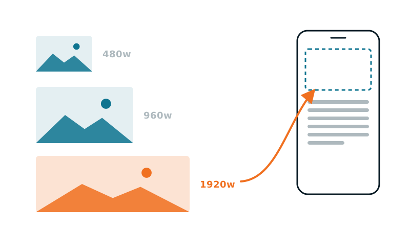
You did everything you were told. Your images have a well-filled srcset, several widths generated, WebP (a next-gen image format, lighter than JPEG or PNG). And yet the PageSpeed Insights audit still shows Properly size images, with several hundred KB listed as savings.
This is not a PageSpeed bug. It is a very common misunderstanding of how responsive images actually work. Let us clear it up for good.
What srcset does, and what it does not
Take a typical case:
<img
  src="photo-1200.jpg"
  srcset="photo-400.jpg 400w,
          photo-800.jpg 800w,
          photo-1200.jpg 1200w,
          photo-2000.jpg 2000w">
Many people think the browser will “pick the most suitable one”. In reality, srcset on its own is just a menu. It says: here are the available sizes and their real width in pixels. It says nothing about the space the image takes up in your page.
Without information about the display width, the browser applies a default: sizes="100vw" (vw = viewport width, the width of the window), meaning “assume the image spans the full width of the window”. And that is where it all goes wrong.
The real cause: the sizes attribute (and the screen-density trap)
The calculation the browser makes is simple:
display width (from sizes) × screen pixel density (the DPR, for Device Pixel Ratio) = target width in pixels → it takes the first image in the srcset ≥ this target.
Let us run two scenarios on a 400px-wide mobile with a Retina screen (DPR = 2, the norm on mobile):
Scenario A: sizes missing (default 100vw)
Assumed width: 400px (100vw)
× DPR 2 = 800px target
But if your image is actually only 180px wide on screen (a thumbnail in a grid), the browser still downloads the 800w variant. 4× too heavy.
Scenario B: correct sizes
sizes="(max-width: 600px) 180px, 300px"Real width: 180px × DPR 2 = 360px target
The browser takes the 400w variant. Weight divided by 4-5.
The conclusion that hurts: a srcset without a correct sizes is almost useless. The browser, when in doubt, takes too big, and PageSpeed sees it.
The DPR is the factor everyone forgets: on mobile most screens are DPR 2 or 3. An image displayed at 200 physical px needs a 400 to 600px source. That is not waste; beyond that, it is.
The WordPress case: the default sizes is often wrong (the #1 cause in practice)
If you are on WordPress, there is a good chance your problem comes from here, and it is not a missing sizes, but an automatic and wrong sizes.
WordPress generates the srcset and a sizes on its own. But the value it puts by default looks like:
sizes="(max-width: 1024px) 100vw, 1024px"In other words: “this image spans the full content width”. That is true for a full-width article image. It is wrong the moment the image lives in a grid, a column, a sidebar, a card, a gallery, which is most cases. The result: sizes announces a width far larger than reality, the browser loads too big, and PageSpeed sees it.
Worse: many page builders (Divi, Elementor…) and themes do not adjust this sizes to the real column. So you have a flawless srcset, well-generated variants… and a sizes that sabotages them. It is the most frequent cause of the “Properly size images” complaint on a WordPress site, and the one you never think to check precisely because “WordPress handles it”.
Diagnose in 30 seconds (without guessing)
Open Chrome DevTools, Elements tab, hover over the <img> tag. Chrome shows:
- Rendered size: the size at which the image is actually displayed.
- Rendered aspect ratio and Intrinsic size: the size of the downloaded file.
- Current source: which variant of the srcset was chosen.
The verdict is immediate. If you see a rendered size of 180px but the current source is photo-800.jpg, your sizes is missing or wrong. If the rendered size is 180px and the current source is photo-400.jpg, you are correct: 400 = 180 × DPR 2, rounded up to the next step.
You can also use the Network tab: sort by size, reload, and watch which variant goes over the wire.
The generic fix (what a developer does by hand)
a. Write a sizes that matches your real layout
This is the heart of the problem. sizes must reflect the real width of the image, the one imposed by your CSS, at each breakpoint (the screen width at which the layout changes). Example for an image full-width on mobile but on 3 columns on desktop:
  sizes="(max-width: 600px) 100vw,
         (max-width: 1024px) 50vw,
         33vw"
b. Generate the right variants
No point having a 2000w variant if your image never exceeds 600px on screen. And conversely: provide the steps that cover your real widths × DPR (up to 2, sometimes 3).
c. Do not forget width and height
They do not change the weight, but they prevent CLS (Cumulative Layout Shift, content that jumps while loading), PageSpeed’s other recurring complaint.
The case where even a perfect sizes is not enough
Some elements carry no srcset at all: sliders (Nivo, Swiper, many themes), CSS background images, or any markup that outputs a raw <img src="...">. There, there is literally nothing to rewrite: no optimization plugin can act, because there is no srcset/sizes to fix. It is a separate problem (images without srcset), which calls for a different approach than the one described here.
For a builder hero set as a CSS background, that approach is in our guide on background image heroes. And when the image is the hero of the page, its size is only half the story: how early it is requested matters as much, which our guide on preloading the LCP image covers.
Why it is so painful to maintain by hand
Writing the right sizes assumes knowing, for each image and each breakpoint, the real CSS display width. On a 5-page brochure site, that is doable. On a site with dozens of templates, grids that change, editorial content… it is unmanageable, and it drifts out of sync with every redesign.
This is exactly the problem Mantys Core solves by measuring rather than guessing:
it renders the page like a real browser and measures the actually displayed width of each image, at each breakpoint;
it rewrites
sizesfrom that measurement: no more default100vw, no more over-download;it generates the useful variants (and their WebP version) aligned with those real widths;
and for images without
srcset(sliders, raw sources), it applies a substitution toward the measured variant, the case classic tools leave aside.
The concrete result: the “Properly size images” complaint disappears because the browser finally downloads the right size, the one your layout actually asks for.
In summary
srcset= a menu of sizes. sizes = the choice instruction. Without the latter, the former is almost useless.- The mobile DPR (×2, ×3) doubles or triples the target width, hence the over-download.
- Diagnose with Rendered size vs Current source in the DevTools.
- The fix = a
sizesfaithful to your real layout + the right variants. By hand it is tedious and fragile; measured and automated, it is reliable.
Comments
Stuck on a similar problem? Describe your setup and what you see. We read every comment and answer.
No comments yet. Be the first to share your case.